Pivot Table Widget
Overview
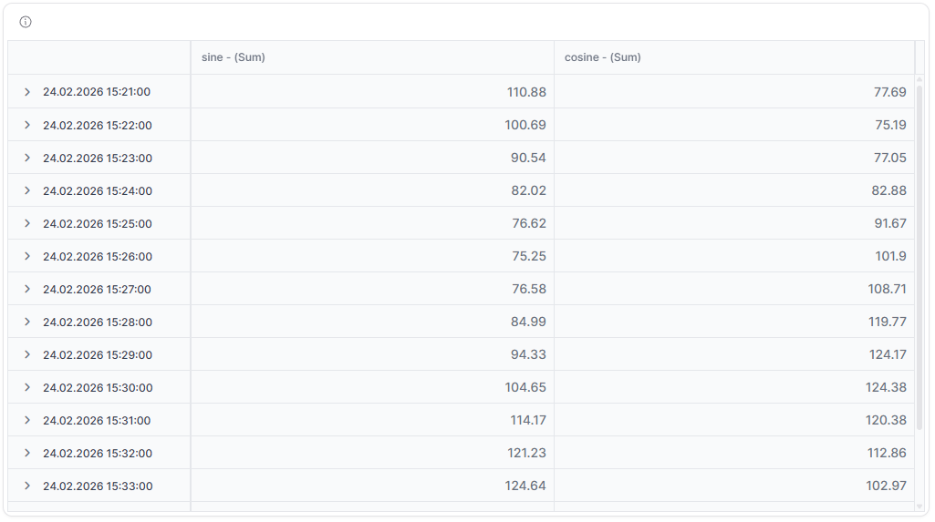
The Pivot Table widget provides a powerful tabular display that groups and aggregates data by various dimensions. It's perfect for analyzing large datasets, creating cross-tabulations and generating quick summaries with the ability to pivot data fields for different analytical views.
Use Cases
- Data Analysis - Explore large datasets with multiple dimensions
- Cross-Tabulation - Create pivot tables showing relationships between variables
- Aggregation - Summarize data by various grouping criteria
- Reporting - Generate detailed reports with subtotals and grand totals
- Trend Analysis - Compare values across different time periods or categories
Key Features
- Multi-dimensional data grouping
- Dynamic row and column pivoting
- Aggregation functions (sum, average, min, max, count)
- Subtotal and grand total calculations
- Filtering and sorting capabilities
- Export to PDF, Excel, or CSV
Configuration
Basic Settings
| Field | Required | Description |
|---|---|---|
| Title | ❌ No | Display name for the widget |
| Measures | ✅ Yes | Choose measures to include from different Things |
Data Settings
| Field | Required | Type | Description |
|---|---|---|---|
| Timeframe | ✅ Yes | WidgetRelativeWindow | Relative time frame for data display |
| Aggregation | ✅ Yes | TimeseriesAggregation | Method to aggregate data (AVG, SUM, MIN, MAX, COUNT) |
| Gapfill | ❌ No | GapFill | Handle missing data (NONE, TIME, LOCF) |
| Table Config | ✅ Yes | any | Table configuration settings (columns, sorting, etc.) |
Each measure in the configuration requires:
- id - Unique identifier
- measure - Telemetry measure name
- thingId - Associated Thing ID
- aggregation - Aggregation method for this specific measure
- alias - Display name for the measure
- dataType - Data type of the characteristic
Display Options
| Field | Required | Description |
|---|---|---|
| Date Alias | ❌ No | Custom label for the date column |
| Date Format | ❌ No | Format string for date display |
| Override | ❌ No | Use widget-specific time settings instead of dashboard defaults |
| Transparent | ❌ No | Remove widget background |
| Border color | ❌ No | Custom border color |
| Background Color | ❌ No | Custom background color |
Best Practices
- Limit Dimensions - Use 2-3 dimensions for optimal readability
- Choose Appropriate Aggregation - Select aggregation that matches your analysis needs
- Use Filters - Apply filters to focus on relevant data
What's Next?
- Dashboards - Learn about dashboard management