Boolean Widget
Overview
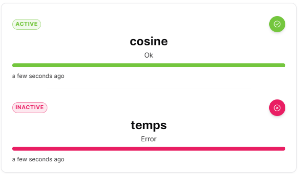
The Boolean widget displays boolean values with clear on/off or true/false indicators. It provides immediate visual feedback for binary states, making it perfect for switches, alarms and digital inputs.
Use Cases
- Digital Inputs - Display sensor on/off states
- Alarm Status - Show active/inactive alarms
- Switch States - Monitor switch positions
- Binary Conditions - Display true/false conditions
- Mode Indicators - Show enabled/disabled modes
Key Features
- Clear binary state display
- Customizable on/off labels
- Color-coded indicators
Configuration
Basic Settings
| Field | Required | Description |
|---|---|---|
| Thing | ✅ Yes | Select Thing to monitor |
| Measures | ✅ Yes | Add measures to display. |
Display Options
| Field | Required | Description |
|---|---|---|
| Carousel mode | ❌ No | Toggle between stacked (default) and carousel display mode |
| Orientation | ❌ No | Choose 'vertical' (default) or 'horizontal' layout |
| True | ❌ No | Custom label for true state (supports multiple languages) |
| False | ❌ No | Custom label for false state (supports multiple languages) |
| Color when true | ❌ No | Color for true state (default: #74c63e) |
| Color when false | ❌ No | Color for false state (default: #d4ced6) |
| Transparent | ❌ No | Remove widget background |
| Border color | ❌ No | Custom border color |
| Background Color | ❌ No | Custom background color |
Best Practices
- Clear Labels - Use intuitive labels (On/Off, Yes/No, Active/Inactive)
- Color Standards - Use consistent colors across dashboard
- Grouping - Group related boolean widgets together
- Alarm Integration - Use for critical binary alerts
- Size Consistency - Maintain uniform widget sizes for visual alignment
What's Next?
- Status Widget - For multi-state displays
- State Widget - For numeric values