State Widget
Overview
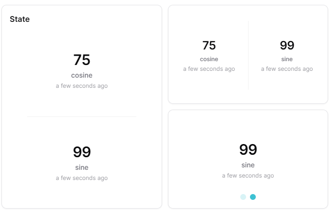
The State widget displays the current snapshot values of one or more measures as value cards. It supports carousel (swipeable) and stacked (grid) layouts, with horizontal or vertical orientation. It provides a clear, prominent display of current measurement values, ideal for monitoring critical parameters at a glance.
Use Cases
- Critical Monitoring - Display important measurements prominently
- Multi-Measure Dashboard - Show several measure values in a compact layout
- KPI Display - Present key performance indicators
- Value Tracking - Monitor specific sensor readings
- Status Overview - Quickly see current values for multiple measures
Key Features
- Large value display
- Multiple measures support
- Carousel or stacked layout modes
- Horizontal and vertical orientation
- Unit display
- Real-time updates
Configuration
Basic Settings
| Field | Required | Description |
|---|---|---|
| Title | ❌ No | Display name for the widget |
| Measures | ✅ Yes | Add measures to display. Each measure requires: measure ID and optional aggregation |
Display Options
| Field | Required | Description |
|---|---|---|
| Carousel mode | ❌ No | Toggle between stacked (default) and carousel display mode |
| Orientation | ❌ No | Choose 'vertical' (default) or 'horizontal' layout |
| Compact number | ❌ No | Display large numbers in compact format (e.g., 1.23K). Default: enabled |
| Transparent | ❌ No | Remove widget background |
| Border color | ❌ No | Custom border color |
| Background Color | ❌ No | Custom background color |
| Translations | ❌ No | Custom translations for the widget name |
Best Practices
- Critical Values - Use for most important measurements
- Threshold Configuration - Set meaningful color thresholds
- Widget Placement - Position prominently on dashboard
- Multiple States - Use multiple widgets for related measurements
- Clear Titles - Use descriptive names for quick identification
What's Next?
- Status Widget - For status indicators
- Gauge Widget - For KPI visualization