Overview
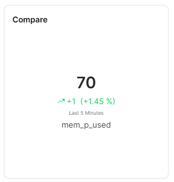
The Compare widget displays a single measure's current value alongside the change from a previous time period. It prominently shows the current value, the numeric difference, a trend arrow (up or down) and the percentage change - providing immediate insight into whether a metric is improving or declining.
Use Cases
- Trend Monitoring - See if a value is going up or down compared to a previous period
- KPI Tracking - Display a KPI with its percentage change over time
- Performance Comparison - Compare current performance against a prior baseline
- Quick Insights - Get an at-a-glance view of value direction and magnitude
- Operational Metrics - Monitor metrics like throughput, temperature, or efficiency trends
Key Features
- Prominent current value display
- Trend arrow (up/down) indicator
- Numeric difference calculation
- Percentage change display
- Configurable comparison timeframe
- Compact number formatting
Configuration
Basic Settings
| Field | Required | Description |
|---|
| Title | ❌ No | Display name for the widget |
| Thing | ✅ Yes | Select Thing to display data from (not required for ThingType dashboards) |
| Measure | ✅ Yes | Choose measure to compare |
| Timeframe | ✅ Yes | Time range (from/to) for data display |
Display Options
| Field | Required | Description |
|---|
| Compact number | ❌ No | Display numbers in compact format (e.g., 1.23K). Default: enabled |
| Transparent | ❌ No | Remove widget background |
| Border color | ❌ No | Custom border color |
| Background Color | ❌ No | Custom background color |
Best Practices
- Like-for-Like - Compare similar measurements for meaningful insights
- Consistent Time Periods - Use equal time periods for fair comparison
- Context - Provide context for what is being compared
- Change Indicators - Use visual cues for significant changes
- Regular Reviews - Update comparison periods regularly
What's Next?