
Overview
The Gauge widget displays a measure value on a gauge with configurable threshold color zones. It supports both radial (semi-circular, like a tachometer) and linear gauge shapes. It's ideal for displaying KPIs, performance indicators and values that need to be compared against defined ranges.
Use Cases
- KPI Monitoring - Display key performance indicators
- Target Tracking - Show progress towards targets
- Performance Metrics - Visualize performance levels
- Capacity Indicators - Show utilization levels
- Alert Visualization - Display values with threshold zones
Key Features
- Radial and linear gauge shapes
- Threshold color zones
- Current value pointer
- Min/max value indicators
- Target value markers
- Compact number formatting
Configuration
Basic Settings
| Field | Required | Description |
|---|
| Title | ❌ No | Display name for the widget |
| Thing | ✅ Yes | Select Thing to display data from (not required for ThingType dashboards) |
| Measure | ✅ Yes | Choose measure to display |
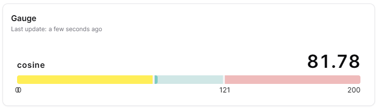
| Shape | ✅ Yes | Choose 'arc' (semi-circular) or 'linear' (horizontal bar) display |
Gauge Settings
| Field | Required | Description |
|---|
| Min Value | ✅ Yes | Minimum gauge value |
| Max Value | ✅ Yes | Maximum gauge value (must be greater than min) |
| Thresholds | ✅ Yes | Define color zones with name, min value, max value and color. Each threshold must be within the gauge min/max range |
| Compact number | ❌ No | Display large numbers in compact format (e.g., 1.23K) |
Display Options
| Field | Required | Description |
|---|
| Transparent | ❌ No | Remove widget background |
| Border color | ❌ No | Custom border color |
| Background Color | ❌ No | Custom background color |
Best Practices
- Meaningful Ranges -Set min/max values that make sense for the metric
- Threshold Zones - Use 3-4 color zones (good, warning, critical)
- Target Indicators - Mark target values clearly
- Compact Display - Keep gauges reasonably sized
- Dashboard Grouping - Group related gauges together
What's Next?