Overview
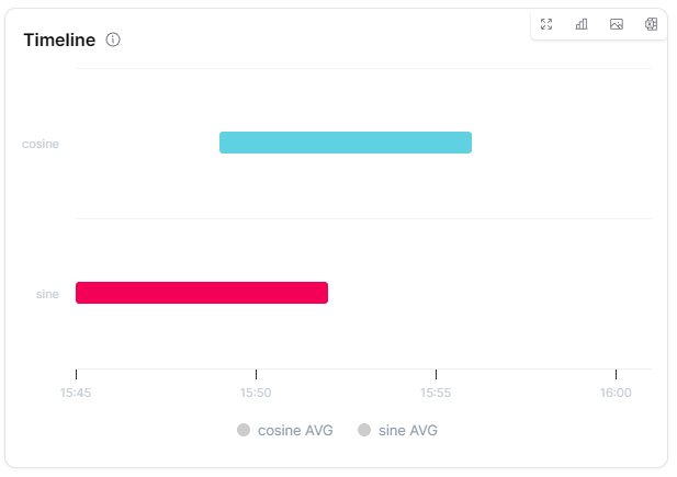
The Timeline widget displays measure states over time as colored horizontal bars in a Gantt-like X-Range chart. Each bar represents a time period during which a measure matched a defined condition (value range or exact value), making it ideal for visualizing operational states, machine run/stop cycles and condition-based status history.
Use Cases
- Machine States - Visualize run, idle and stop periods as colored bars
- Condition Monitoring - Show when measures were in normal, warning, or critical ranges
- Boolean State History - Display on/off or true/false states over time
- Multi-Measure Comparison - Compare state timelines across multiple measures as parallel swim lanes
- Operational Analysis - Analyze uptime, downtime and state transitions
Key Features
- Gantt-like colored bars for state durations
- Condition-based coloring (range or exact value)
- Multiple measures as parallel swim lanes
- Zoom with dynamic data re-fetch
- Merge consecutive matching datapoints
- Chart, table, or split display mode
Configuration
Basic Settings
| Field | Required | Description |
|---|
| Title | ❌ No | Display name for the widget |
| Thing | ✅ Yes | Select Thing to display data from (not required for ThingType dashboards) |
| Timeframe | ✅ Yes | Time range (from/to) for data display |
| Conditions | ✅ Yes | Define timeline conditions. Each condition requires: measures (array), aggregation, name, condition (Range/Value), data (from/to for range, specific value for value) and color |
Chart Settings
| Field | Required | Description |
|---|
| Gapfill | ❌ No | Handle missing data (NONE, TIME, LOCF) |
| Bucket type | ✅ Yes | Choose 'dynamic' or 'fixed' time bucket aggregation |
| Bucketsize / Data density | ✅ Yes | Aggregation interval (depends on bucket type) |
Display Options
| Field | Required | Description |
|---|
| Merge consecutive datapoints | ❌ No | Combine consecutive matching conditions |
| Zoom allowed | ❌ No | Enable zoom functionality (default: true) |
| Display mode | ❌ No | Choose chart, table, or split view |
| Override | ❌ No | Use widget-specific time settings instead of dashboard defaults |
| Translations | ❌ No | Custom translations for condition names and labels |
| Transparent | ❌ No | Remove widget background |
| Border color | ❌ No | Custom border color |
| Background Color | ❌ No | Custom background color |
Best Practices
- Meaningful Conditions - Define clear conditions with descriptive names and distinct colors
- Color Coding - Use intuitive colors (e.g., green for normal, red for critical)
- Appropriate Timeframe - Match the time range to the expected state change frequency
- Merge Consecutive - Enable merging consecutive datapoints for cleaner visualization
- Translations - Add custom translations for condition names when needed
What's Next?