Theme Settings
The Theme page provides comprehensive control over your tenant's visual design and brand identity. Theme customization is organized into three main tabs: Colors, Layout and Shadows.
Accessing Theme Configuration
Navigate to the Theme page to access all customization options:
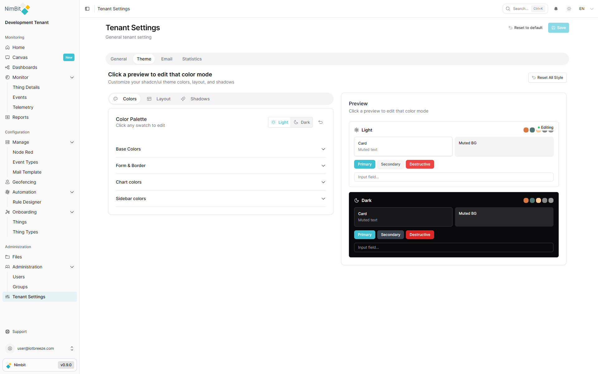
Appearance Mode
Choose which mode you want to customize - Light or Dark:
- Light Mode - Edit the light theme colors and appearance
- Dark Mode - Edit the dark theme colors and appearance
This toggle allows you to customize each mode independently, ensuring your brand looks great in both light and dark interfaces.
Colors
The Colors tab provides comprehensive color customization options organized into four sections.
Base Colors
Define the fundamental colors that form the foundation of your theme:
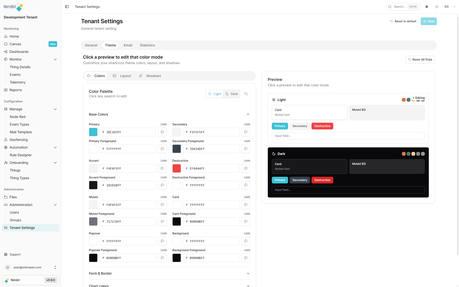
Base colors include:
- Background colors for different UI surfaces
- Text colors for primary and secondary content
- Border colors for separators and containers
- Muted colors for less prominent elements
Form & Border
Customize colors specific to form elements and borders:
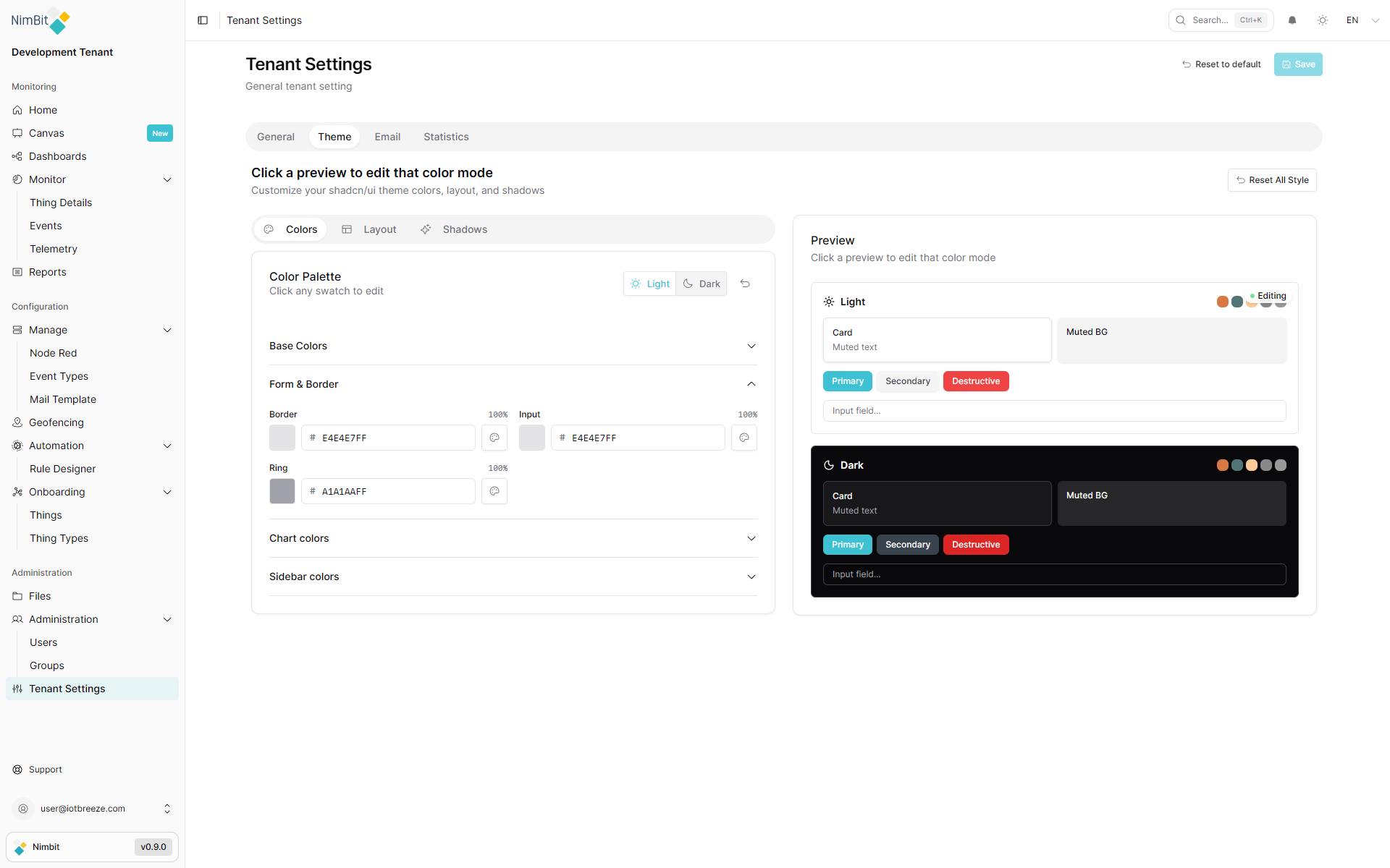
Control the appearance of:
- Input fields and form controls
- Border colors for interactive elements
- Focus states and validation colors
- Form-specific accents
Chart Colors
Define colors used throughout data visualizations and charts:
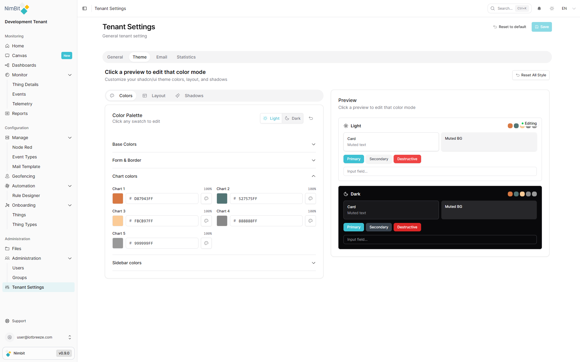
Customize:
- Different chart colors
Sidebar Colors
Set colors specifically for the navigation sidebar:
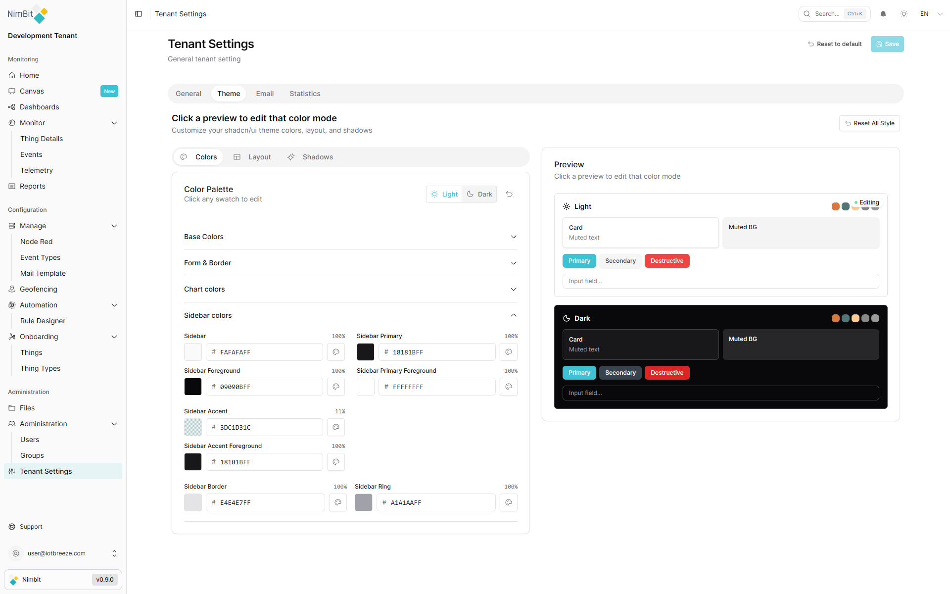
Configure:
- Sidebar background
- Active and inactive item states
- Hover effects
- Navigation text colors
Layout
The Layout tab controls structural aspects of your interface:
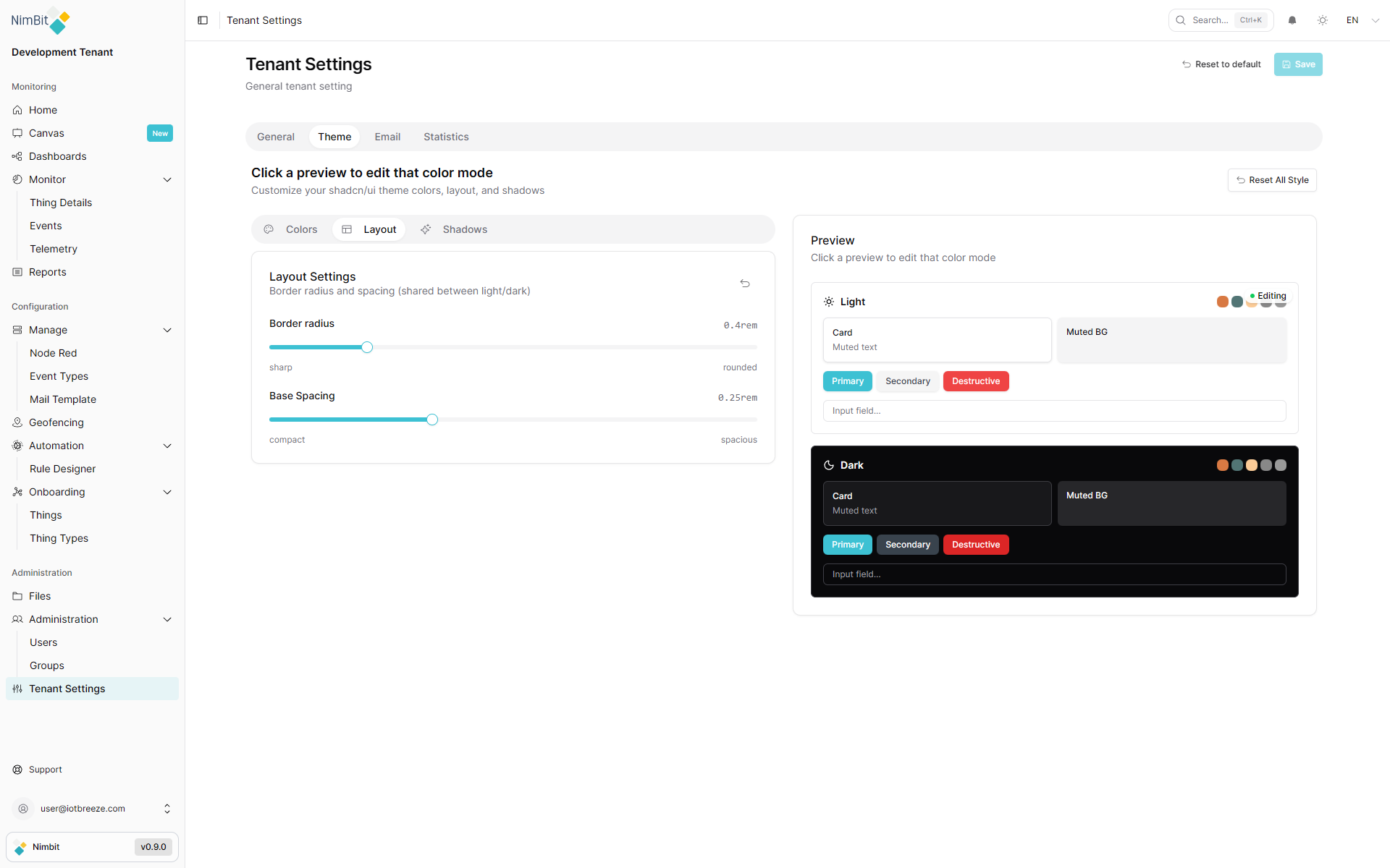
Adjust layout properties including:
- Spacing
- Border radius
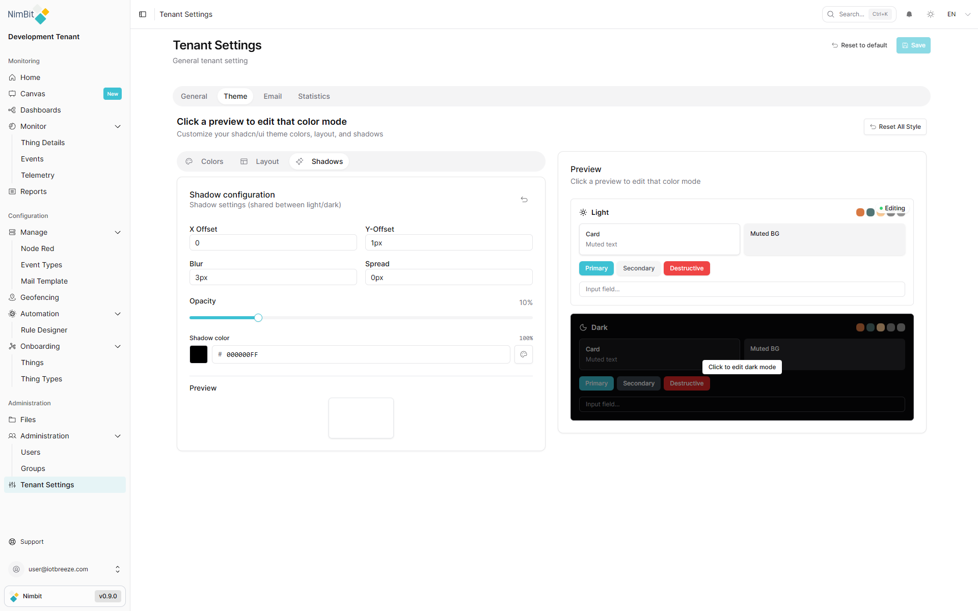
Shadows
The Shadows tab allows you to customize elevation and depth:
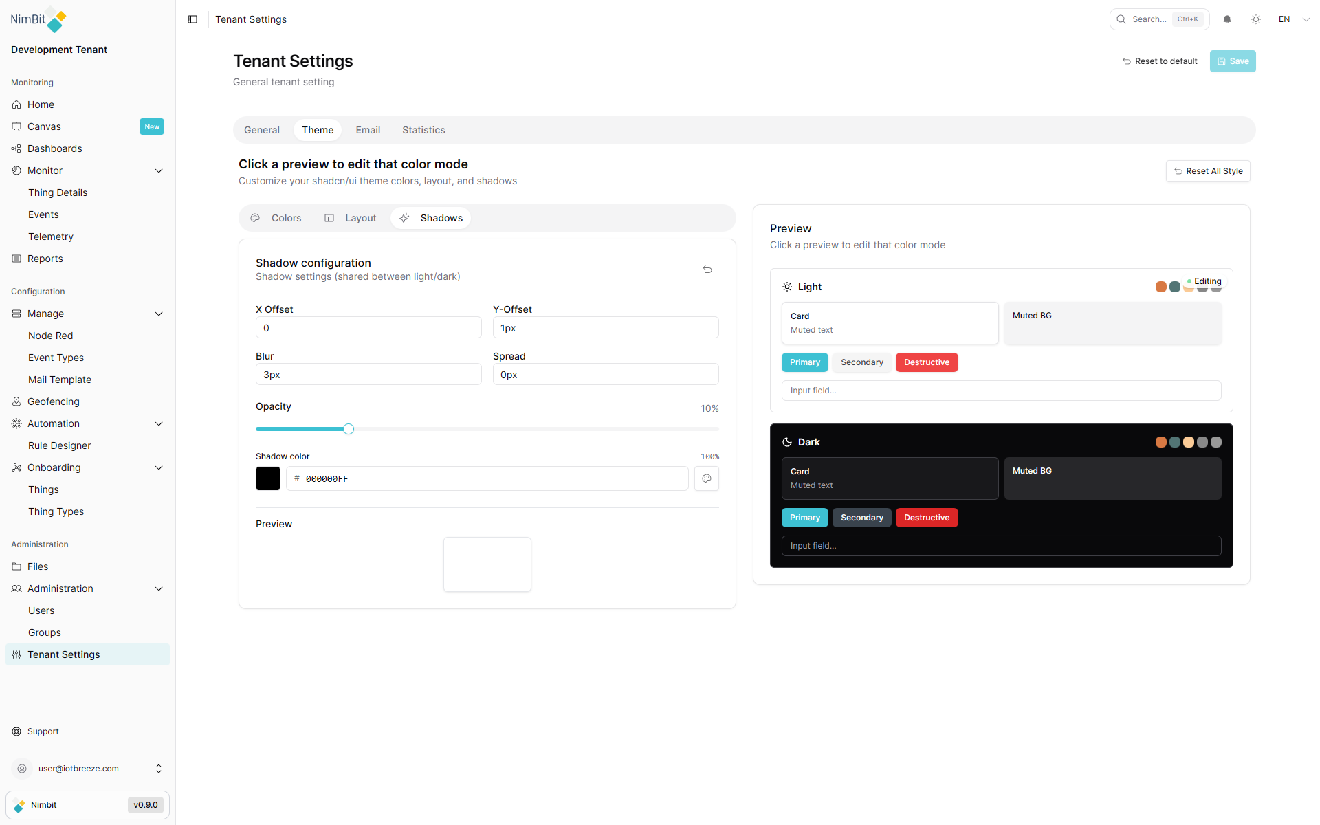
Fine-tune shadow properties:
- Shadow intensity and blur
- Elevation levels for different components
- Shadow colors and opacity
- Depth perception effects
Your custom theme will be applied across the entire tenant environment for all users once saved.