Canvas
The Canvas feature provides an interactive visual workspace for creating diagrams, layouts and visual representations of your IoT assets. Built on a powerful drawing engine, Canvas allows you to visually organize and annotate your things, embed media and build rich visual documentation for your IoT deployments.
Overview
The Canvas feature enables you to:
- Create visual workspaces linked to your IoT things for visual asset management
- Draw and annotate using shapes, text, arrows and freehand tools
- Bind live IoT data to text elements, replacing placeholders with real-time values from device measures, properties and system information
- Embed media and external content directly into your canvas
- Organize layouts with frames, notes and grouping tools
- Customize styling with colors, fills, dash styles and sizes
- Toggle grid alignment for precise element placement
- Export your work in various formats
Accessing the Canvas
To access the Canvas page:
- Navigate to Canvas in the main sidebar under Monitoring
- Alternatively, use the direct URL:
/canvas
Canvases Management
The Canvases Management page displays all existing canvases in a table format with management options.
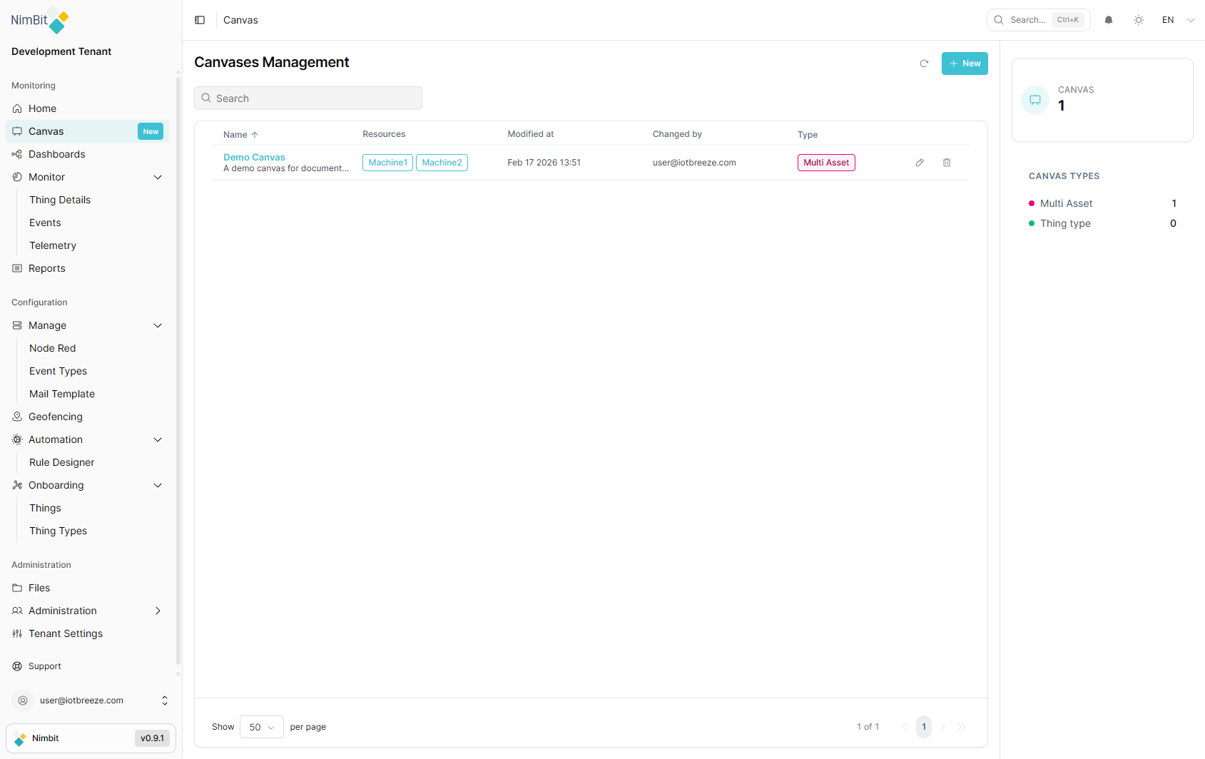
Table Columns
| Column | Description |
|---|---|
| Name | Canvas name with description shown below |
| Resources | Things associated with this canvas, displayed as tags |
| Modified at | Date and time of the last modification |
| Changed by | Email of the user who last modified the canvas |
| Type | Canvas type (Multi Asset or Thing Type) |
Click the Name or Type column headers to sort the table. Click again to reverse the sort order.
Search
Use the Search box at the top of the table to filter canvases by name.
Canvas Types Panel
The right sidebar displays:
- Canvas count - Total number of canvases
- Canvas Types - Breakdown by type with counts:
- Multi Asset - Canvases linked to multiple things
- Thing Type - Canvases linked to a specific thing type
Row Actions
Each canvas row provides two action buttons:
- Edit (pencil icon) - Opens the canvas settings for editing
- Delete (trash icon) - Deletes the canvas
Pagination
The table footer provides pagination controls:
- Show [N] per page - Dropdown to select items per page (default: 50)
- Page navigation - Previous, page numbers, next and last page buttons
- Item counter - Displays "X of Y" total canvases
Creating a Canvas
To create a new canvas:
- Click the + New button in the top-right corner of the Canvases Management page
- The Create Canvas dialog opens with the following fields:
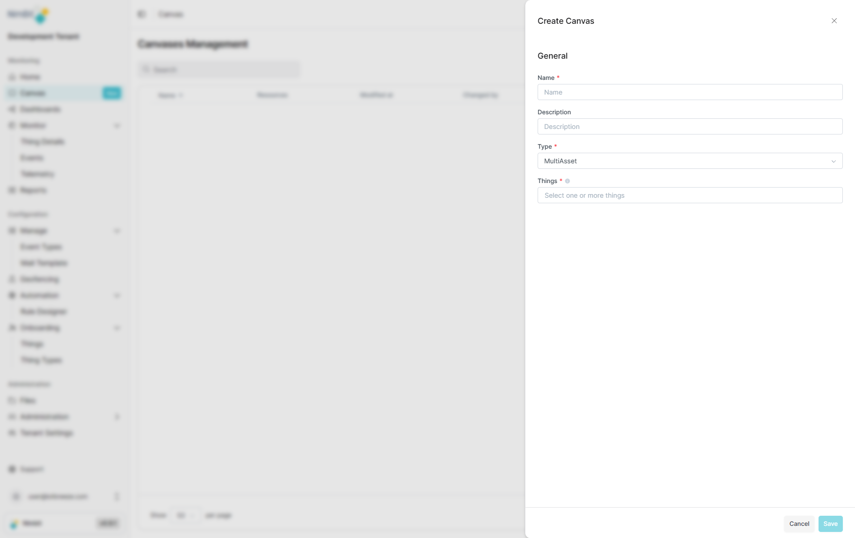
| Field | Required | Description |
|---|---|---|
| Name | ✅ Yes | Enter a descriptive name for the canvas |
| Description | ❌ No | Optional description of the canvas purpose |
| Type | ✅ Yes | Select the canvas type: MultiAsset or ThingType |
| Things | ✅ Yes | Select one or more things to associate with the canvas from the dropdown |
- Fill in the required fields. The Things field allows you to select multiple things from a searchable dropdown
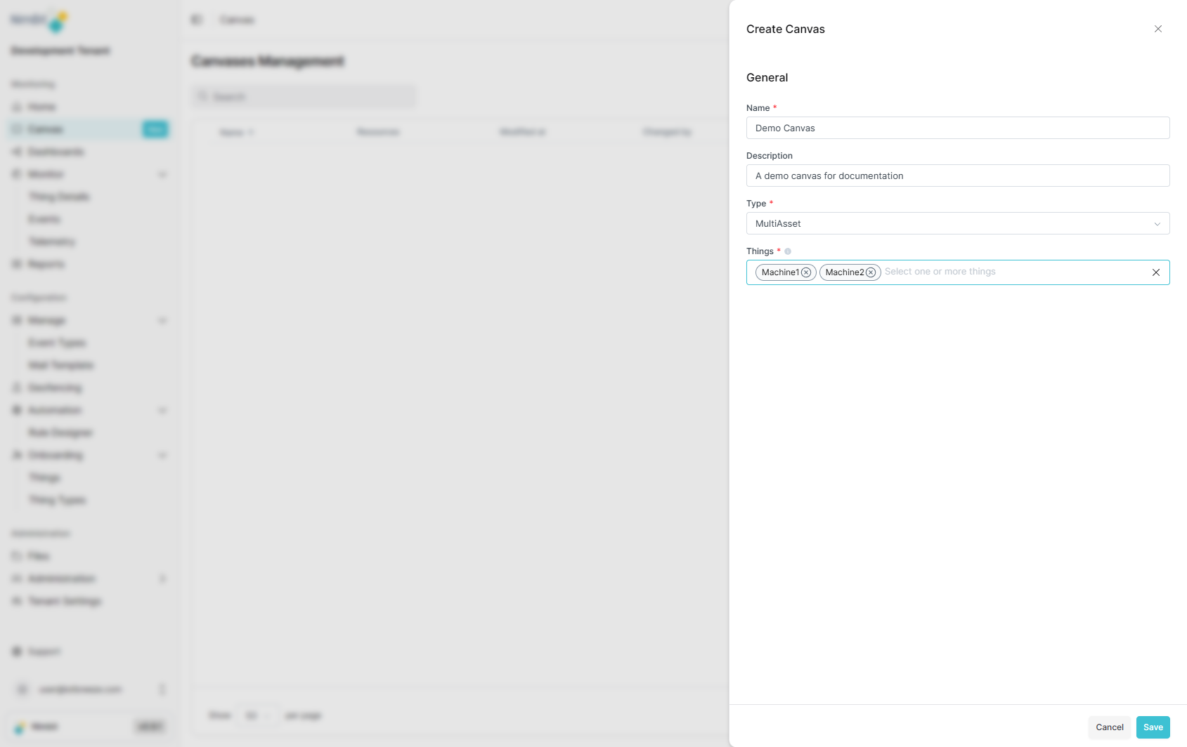
- Click Save to create the canvas
The new canvas appears in the Canvases Management table with its name, associated resources, creation date and type.
Canvas Types
Two canvas types are available:
- MultiAsset - Create a canvas linked to multiple things. Use this type when you want to visualize relationships between different IoT devices or create a combined view of several assets.
- ThingType - Create a canvas linked to a specific thing type. Use this type to create visual templates or documentation that applies to all devices of a particular type.
Canvas Detail View
Click on a canvas name in the Canvases Management table to open its detail view.
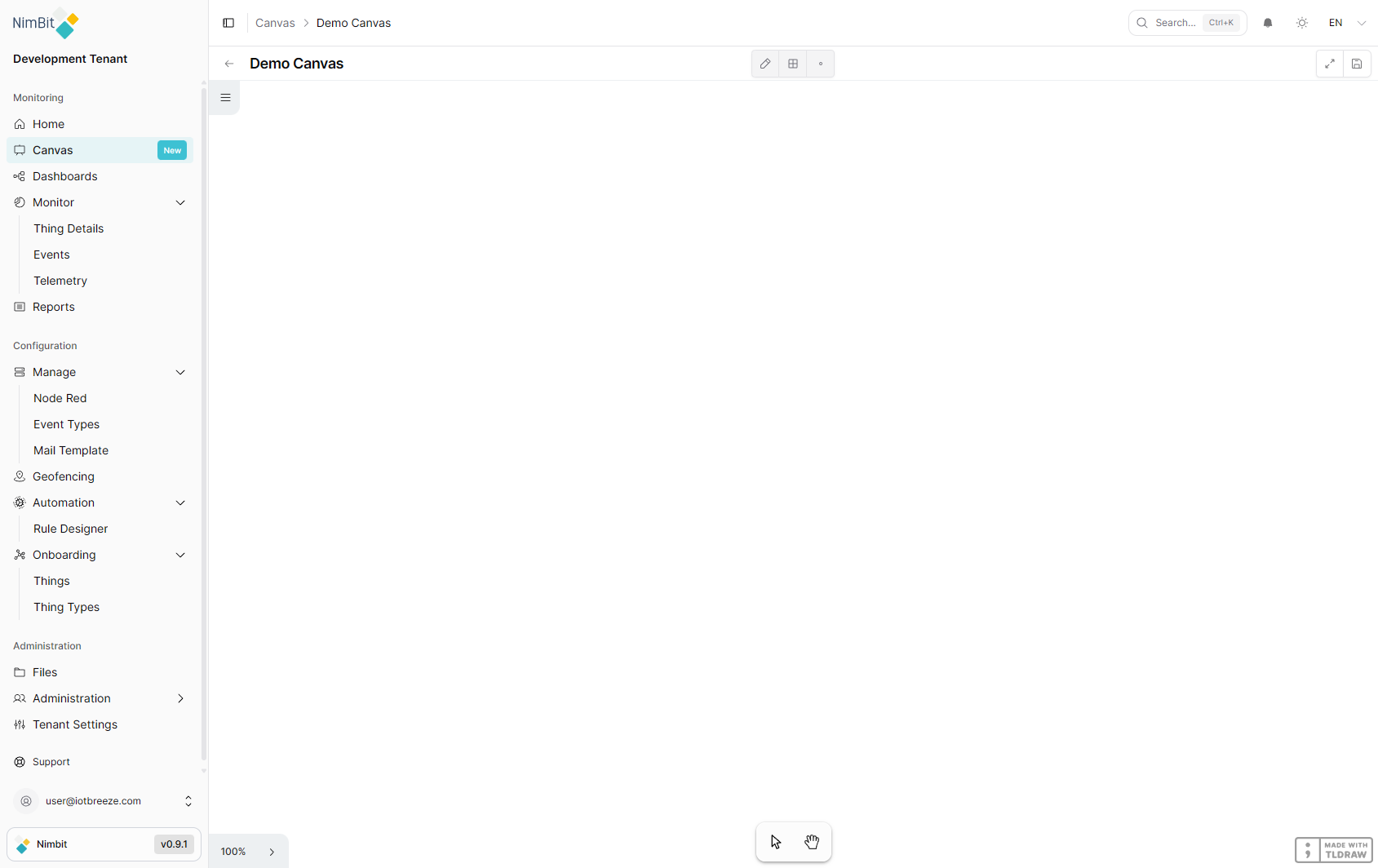
Navigation
- Breadcrumb - Shows the navigation path: Canvas > [Canvas Name]
- Back arrow - Returns to the Canvases Management page
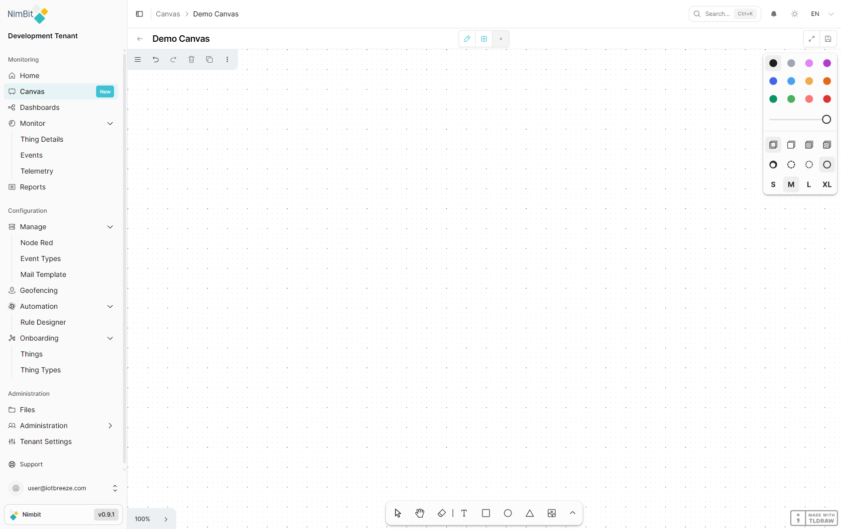
Canvas Controls
Three toggle buttons control the canvas behavior:
| Control | Description |
|---|---|
| Edit | Toggles edit mode. When enabled, the full drawing toolbar and style panel become available |
| Show Grid | Toggles a dot-grid overlay for precise element alignment and placement |
| Focus | Toggles focused mode, hiding the sidebar for a distraction-free canvas experience |
Additional controls in the top-right corner:
- Fullscreen - Expands the canvas to fill the entire screen
- Save Button - Saves the current canvas state
View Mode
When edit mode is off, the canvas is in read-only view mode with minimal controls:
- Select tool - Click and drag to select and inspect elements
- Hand tool - Click and drag to pan around the canvas
- Zoom control - Shows the current zoom level (e.g., 100%) with click to adjust
- Toggle minimap - Shows or hides a minimap for navigation on large canvases
Edit Mode
Click the Edit button to enable full editing capabilities.
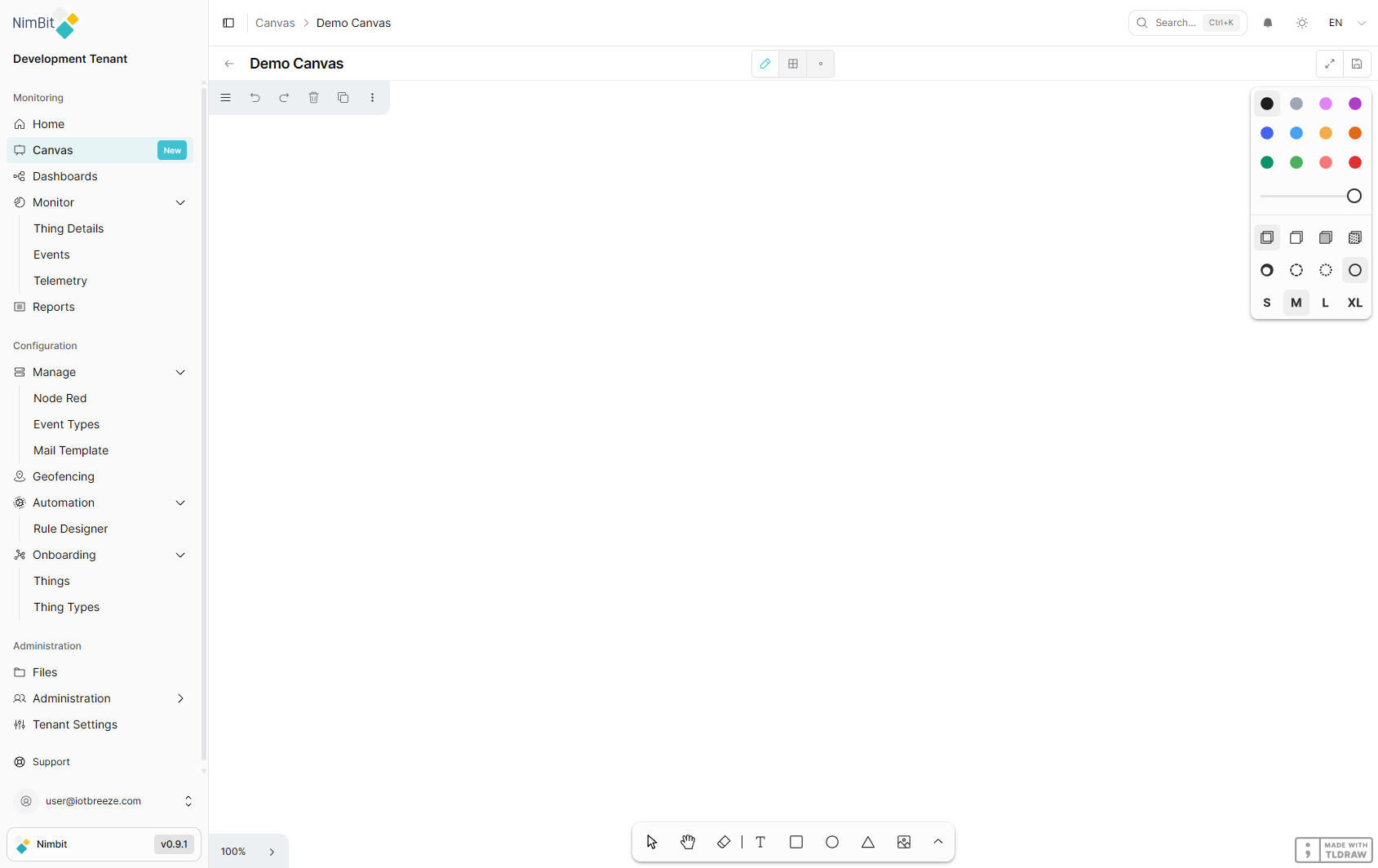
Action Bar
The top action bar provides quick access to common operations:
| Action | Shortcut | Description |
|---|---|---|
| Menu | - | Opens the main menu with additional options |
| Undo | Ctrl + Z | Undo the last action |
| Redo | Ctrl + Shift + Z | Redo the last undone action |
| Delete | Backspace | Delete selected elements |
| Duplicate | Ctrl + D | Duplicate selected elements |
| Actions | - | Additional action options |
Drawing Tools
The bottom toolbar provides drawing and shape tools:
Primary tools:
| Tool | Description |
|---|---|
| Select | Select, move and resize elements |
| Hand | Pan around the canvas without selecting elements |
| Eraser | Erase elements by clicking or dragging over them |
| Text | Add text labels and annotations |
| Rectangle | Draw rectangular shapes |
| Ellipse | Draw circular and elliptical shapes |
| Triangle | Draw triangular shapes |
| Media | Insert images and media files |
Additional tools (accessible via the More button):
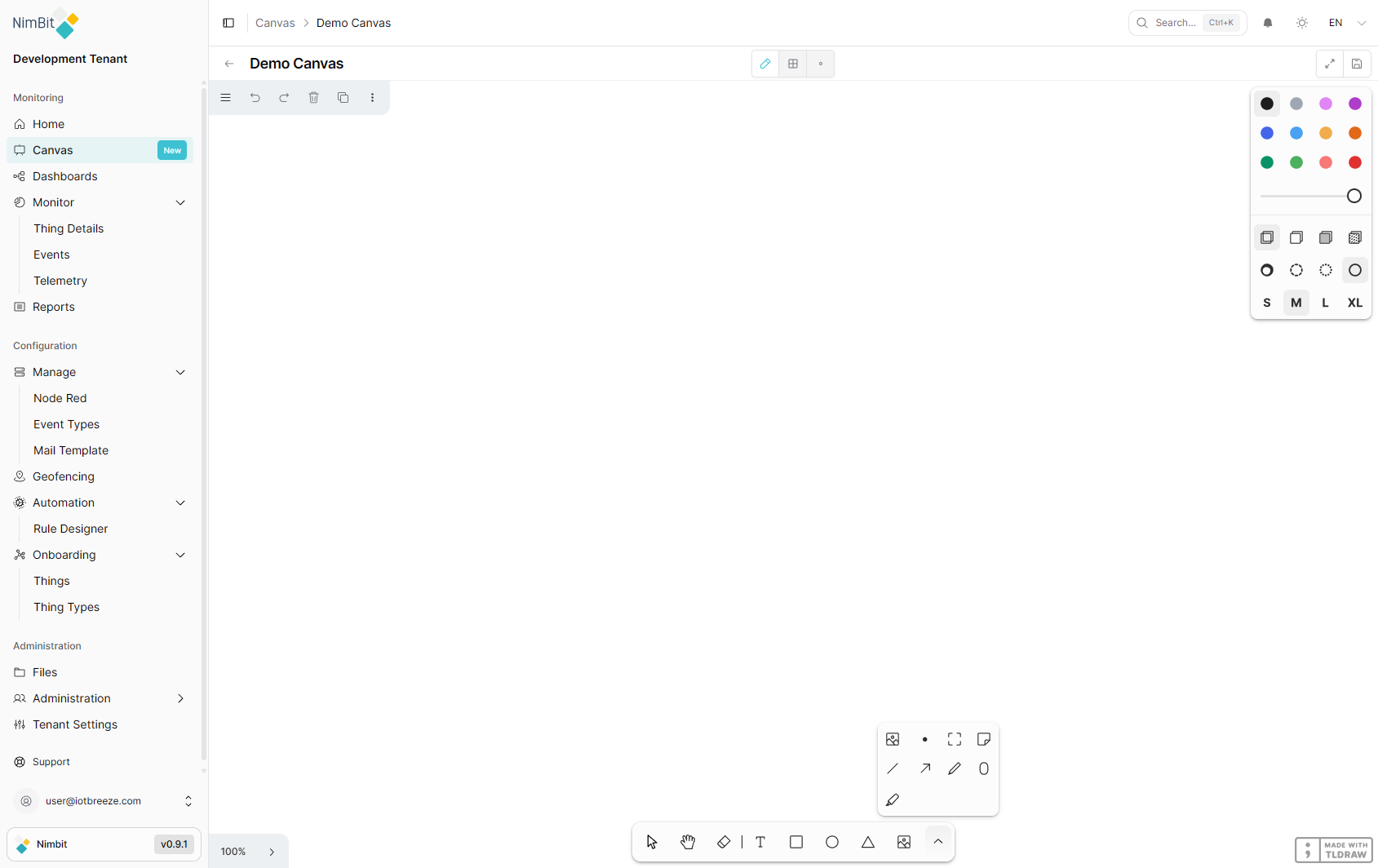
| Tool | Description |
|---|---|
| Media | Insert images and media files |
| Embed | Embed external content (websites, videos, etc.) |
| Frame | Create frames to group and organize elements |
| Note | Add sticky note-style annotations |
| Line | Draw straight lines |
| Arrow | Draw arrows for connections and flow indicators |
| Draw | Freehand drawing tool |
| Oval | Draw oval shapes |
| Highlight | Highlight areas with a semi-transparent marker |
Style Panel
The right-side style panel allows you to customize the appearance of elements:
Color Choose from 12 colors: Black, Grey, Light violet, Violet, Blue, Light blue, Yellow, Orange, Green, Light green, Light red, Red.
Opacity Adjust element transparency from 0% to 100% using the opacity slider.
Fill Control the fill style of shapes:
| Option | Description |
|---|---|
| None | No fill (outline only) |
| Semi | Semi-transparent fill |
| Solid | Solid color fill |
| Pattern | Patterned fill |
Dash Control the line/border style:
| Option | Description |
|---|---|
| Draw | Hand-drawn style line |
| Dashed | Dashed line |
| Dotted | Dotted line |
| Solid | Solid continuous line |
Size Set the stroke/element size: S (Small), M (Medium), L (Large), XL (Extra Large).
Menu
The menu (hamburger icon) provides access to additional features:
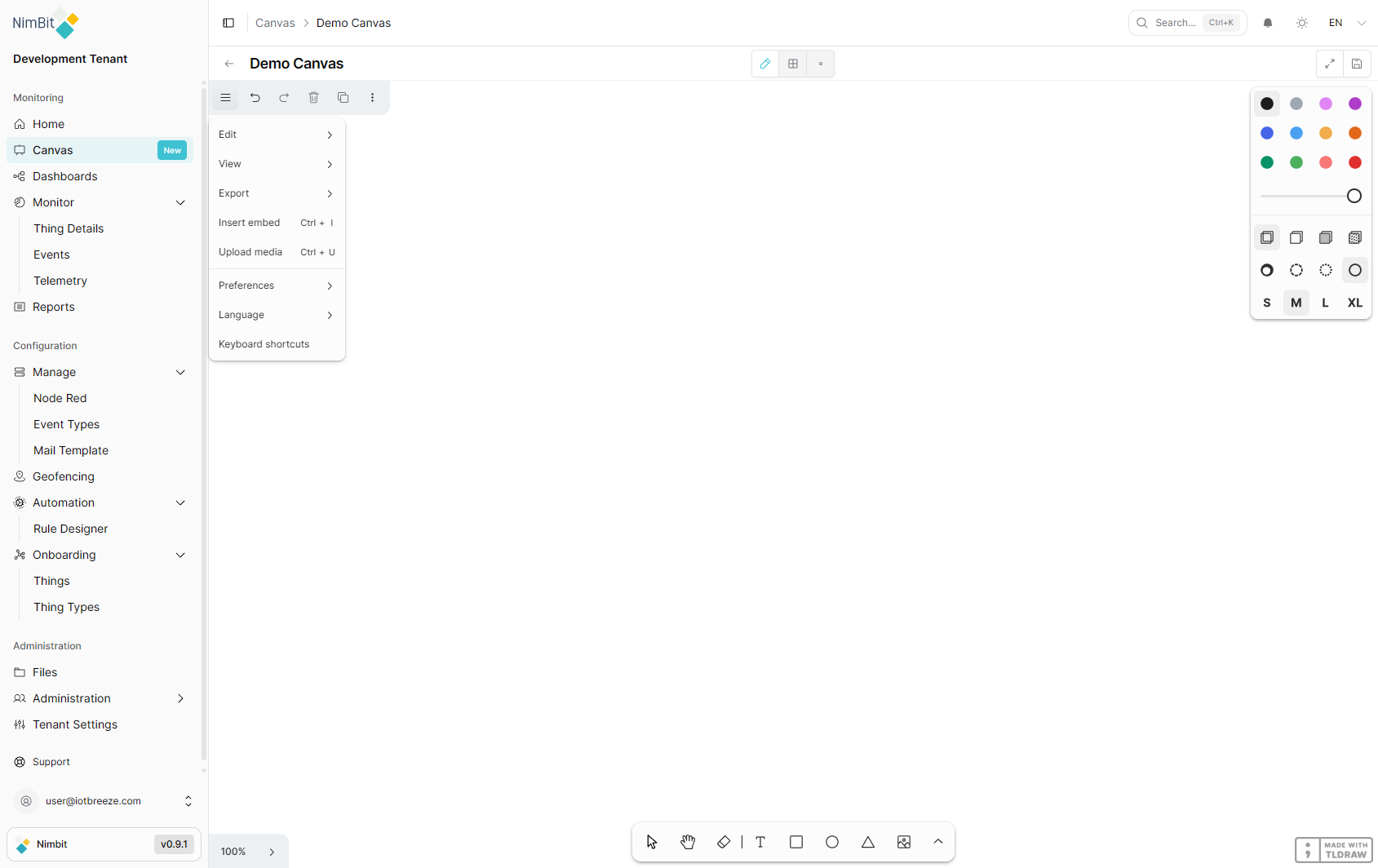
| Menu Item | Shortcut | Description |
|---|---|---|
| Edit | - | Submenu with editing operations |
| View | - | Submenu with view options |
| Export | - | Submenu with export formats |
| Insert embed | Ctrl + I | Embed external content into the canvas |
| Upload media | Ctrl + U | Upload an image or media file to the canvas |
| Preferences | - | Canvas preferences and settings |
| Language | - | Change the canvas interface language |
| Keyboard shortcuts | - | View all available keyboard shortcuts |
Text Formatting
When you create a text element and select text within it, a floating rich-text toolbar appears above the selection. This toolbar provides text formatting options and access to the Bind Value feature.
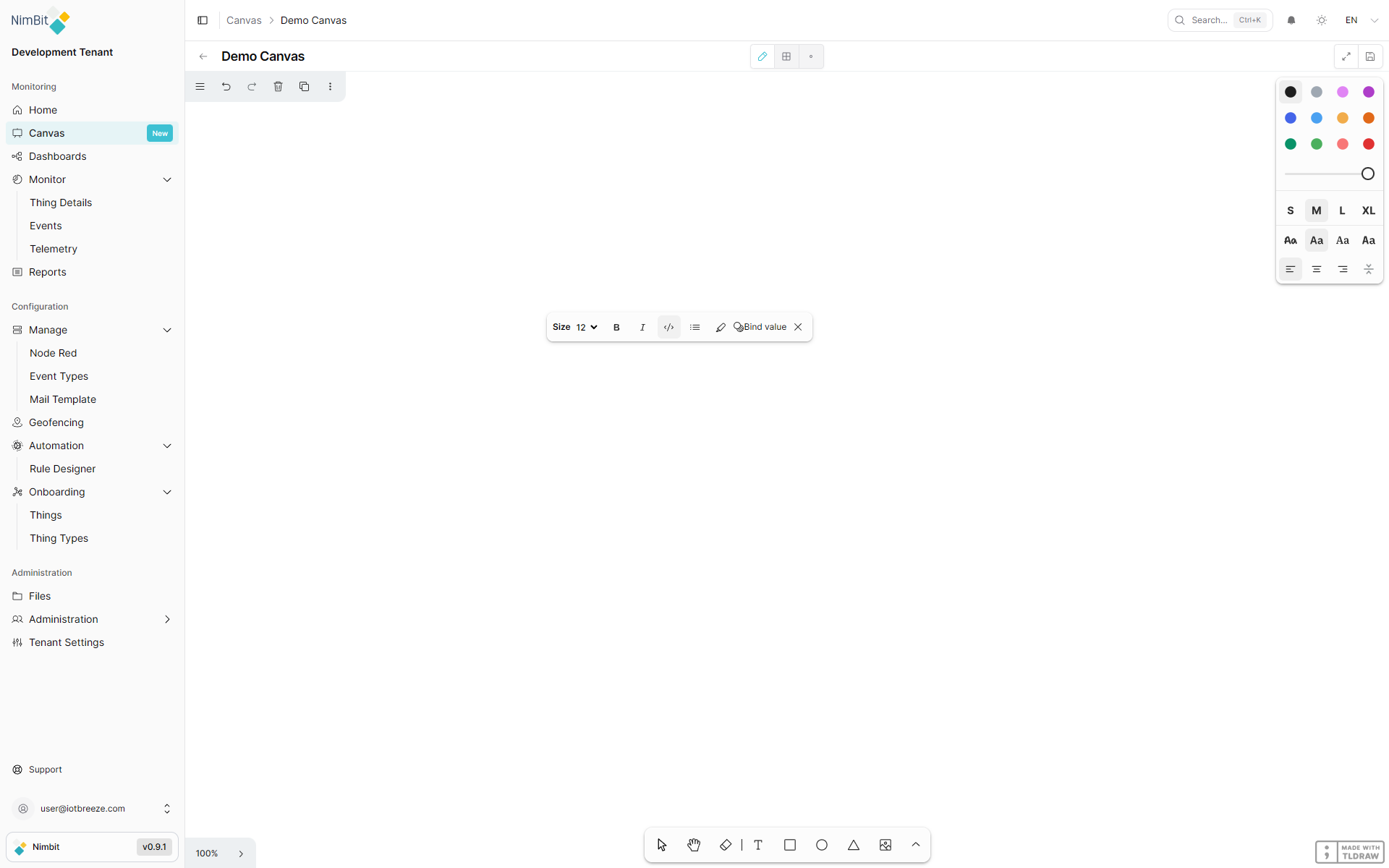
Toolbar Options
| Option | Description |
|---|---|
| Size | Font size dropdown (e.g., 12, 16, 24, etc.) |
| Bold (B) | Toggle bold formatting on selected text |
| Italic (I) | Toggle italic formatting on selected text |
Code (</>) | Toggle monospace/code formatting |
| List (≡) | Bulleted list formatting |
| Highlight | Highlight selected text |
| Bind value | Open the Bind Value dialog to link text to live IoT data |
| Remove (×) | Remove an existing binding from the selected text |
Bind Value
The Bind Value feature connects text on your canvas to live IoT data. When a value is bound, the text acts as a placeholder in edit mode and is automatically replaced with the actual data value when the canvas is viewed in read-only mode. This enables you to create dynamic, data-driven visual layouts that update in real time.
In edit mode, bound text displays a placeholder or default value. In view mode, the bound text is replaced with the actual live data from your IoT devices, updating automatically as new data arrives.
Binding a Value
To bind text to a live data source:
- In edit mode, create a Text element on the canvas
- Type your placeholder text (e.g., "Temperature: value")
- Select the text you want to bind (here the "value") - the text formatting toolbar appears
- Click the Bind value button in the toolbar
- The Bind Value dialog opens
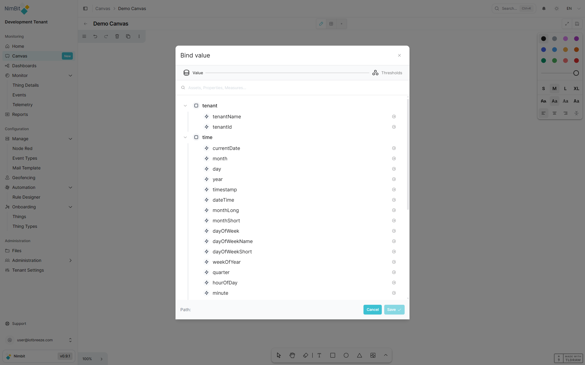
Selecting a Data Source
The Bind Value dialog presents a searchable tree of all available data sources:
| Category | Description |
|---|---|
| tenant | Tenant information: tenantName, tenantId |
| time | Time values: currentDate, month, day, year, timestamp, dateTime, formattedTime, formattedDate, dayOfWeek, dayOfWeekName and more |
| device | Device data (single-device canvas): displayName, status, lastUpdate, plus nested thingType, properties and measures |
| devices | Device data (multi-asset canvas): same structure as device, organized by device ID |
To select a value:
- Search using the search bar at the top, or expand tree nodes to browse
- Navigate through the hierarchy (e.g., device → measures → temperature → value)
- Click the target value - the Path at the bottom of the dialog shows your selection
- Click Save to apply the binding
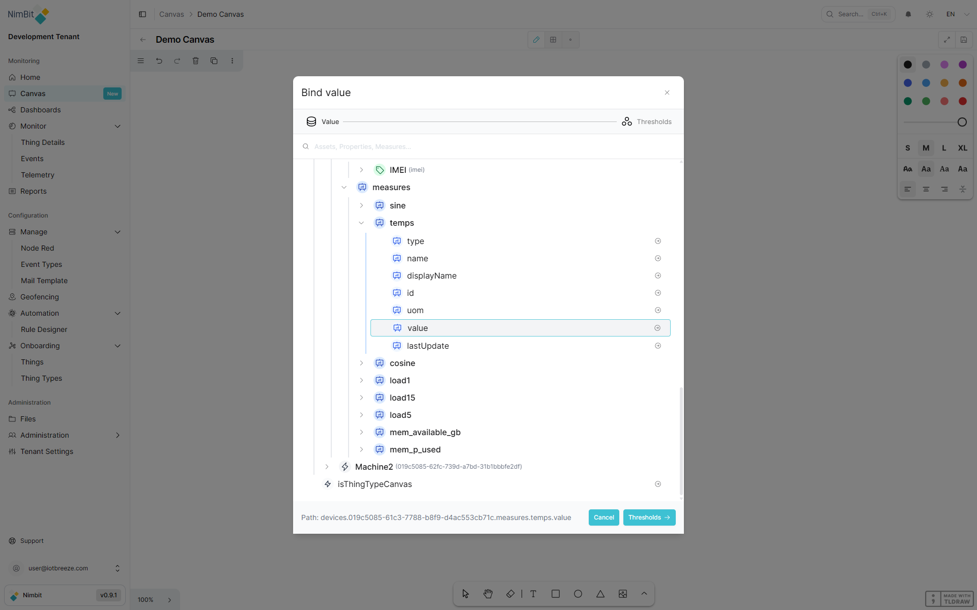
Device Data Sources
Under each device, you can access:
- Properties - Static device properties, each with
displayNameandvalue - Measures - Live telemetry data, each with:
value- The current measurement value (updates in real time)lastUpdate- Timestamp of the last data updatedisplayName- Human-readable name of the measureunit/uom- Unit of measurementtype,name,id,tags- Additional metadata
Configuring Thresholds
When binding to a numeric value (such as a measure's value), you can optionally configure thresholds to change the text and background color based on the data value.
| Setting | Description |
|---|---|
| Operator | Comparison operator: >, <, =, ≤, ≥, or range |
| Value | The threshold value to compare against |
| Value 2 | Upper bound (only for range operator) |
| Background color | Background color applied when threshold is met |
| Text color | Text color applied when threshold is met |
You can add multiple thresholds. The first matching threshold determines the styling.
Example: Set operator >, value 50, background color red, text color white - when the bound measure exceeds 50, the text displays with a red background and white text.
Removing a Binding
To remove a binding from text:
- Select the bound text on the canvas
- Click the × (remove) button in the text formatting toolbar
The text reverts to plain, unbound text.
Grid Mode
Toggle the Show Grid button to display a dot-grid overlay on the canvas. The grid helps with:
- Aligning elements precisely
- Maintaining consistent spacing between elements
- Creating structured, organized layouts